CASE STUDY 01
CASE STUDY 01
The Challenge:
The client lacked a clear, cohesive brand system. Inconsistent visuals, unclear messaging, and an unrefined website forced the client to overmanage the creative process, slowing progress and pulling focus from core business operations. What was needed was strategic brand leadership and a polished, unified direction.
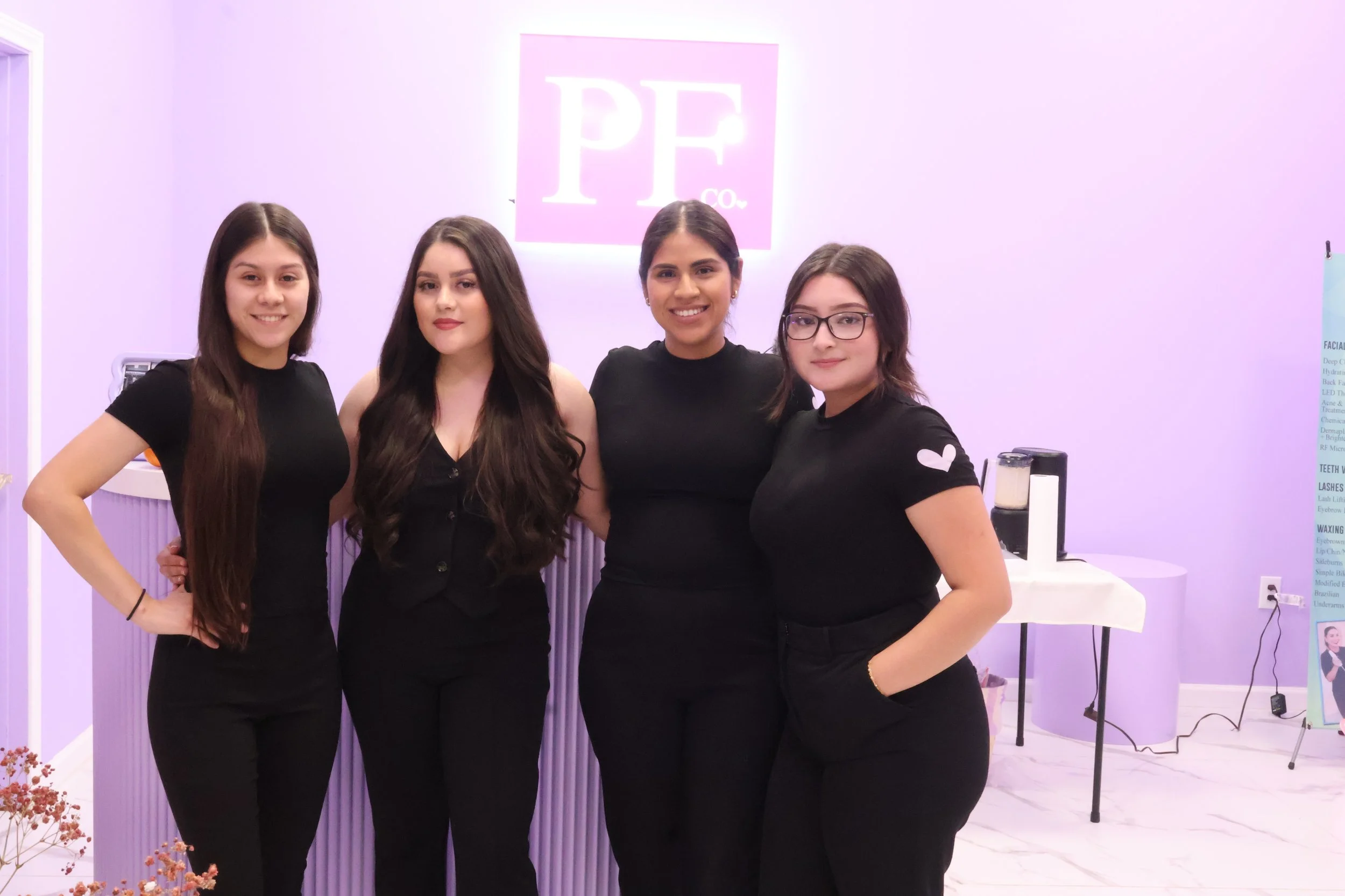
Pretty Female Company
Clothing industry
60 Days
discovery:
Lack Of Alignment
client states “pervious artist just did not have a creative mind”
Strategy:
The approach balanced immediate needs with long-term brand alignment. The client required artwork for signage within a four-day window, so the initial focus was delivering a refined visual identity that could be executed quickly without compromising quality. Rather than initiating a full rebrand, which would have disrupted existing packaging and previous investments, the original logo was deconstructed into a flexible system of three functional marks. This solved the short-term constraint while increasing professionalism and adaptability across brand applications.
At the same time, the strategy established a clear visual lane for the future. The client was guided toward consistent visual storytelling, brand discipline, and a stronger understanding of how cohesion supports positioning and growth. This created a foundation for long-term clarity without sacrificing momentum.
Execution:
The revitalized brand was executed through a cohesive visual and messaging system. A refreshed logo suite was delivered, preserving brand equity while modernizing the overall identity. Core messaging, including the brand story, mission, and vision, was clarified to better communicate purpose and values.
Visual consistency was applied across digital platforms, strengthening the brand’s presence and improving engagement. The identity extended into product design through new merchandise that reinforced recognition and emotional connection. To deepen community impact, an in-store brand experience was designed and launched, translating the revitalized identity into a tangible, empowering moment for the audience.

CASE STUDY 02
The Challenge:
The church had a strong mission but no unified brand identity. Inconsistent visuals, outdated assets, and low digital engagement limited growth. The challenge was to modernize the brand while preserving faith, integrity, and purpose.
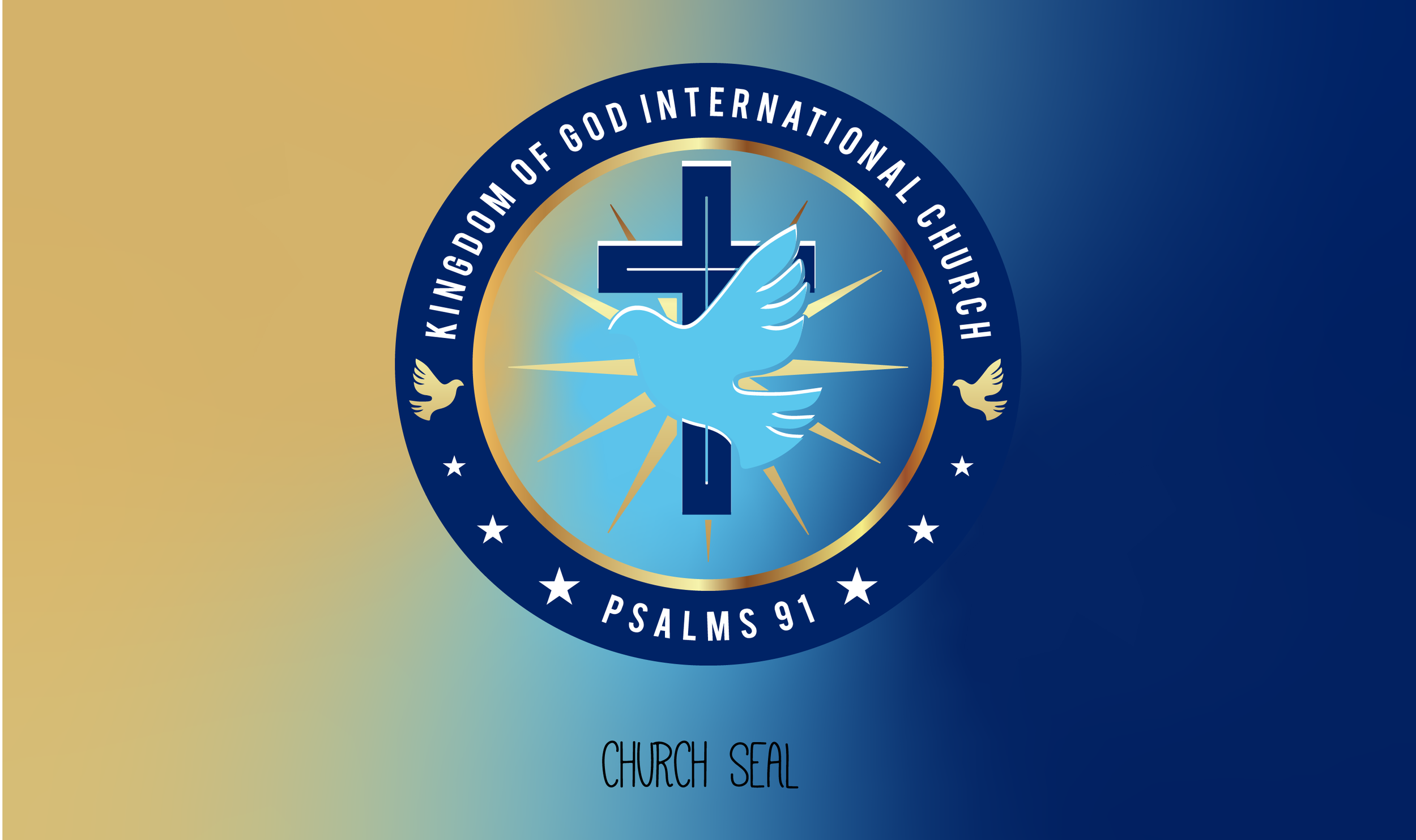
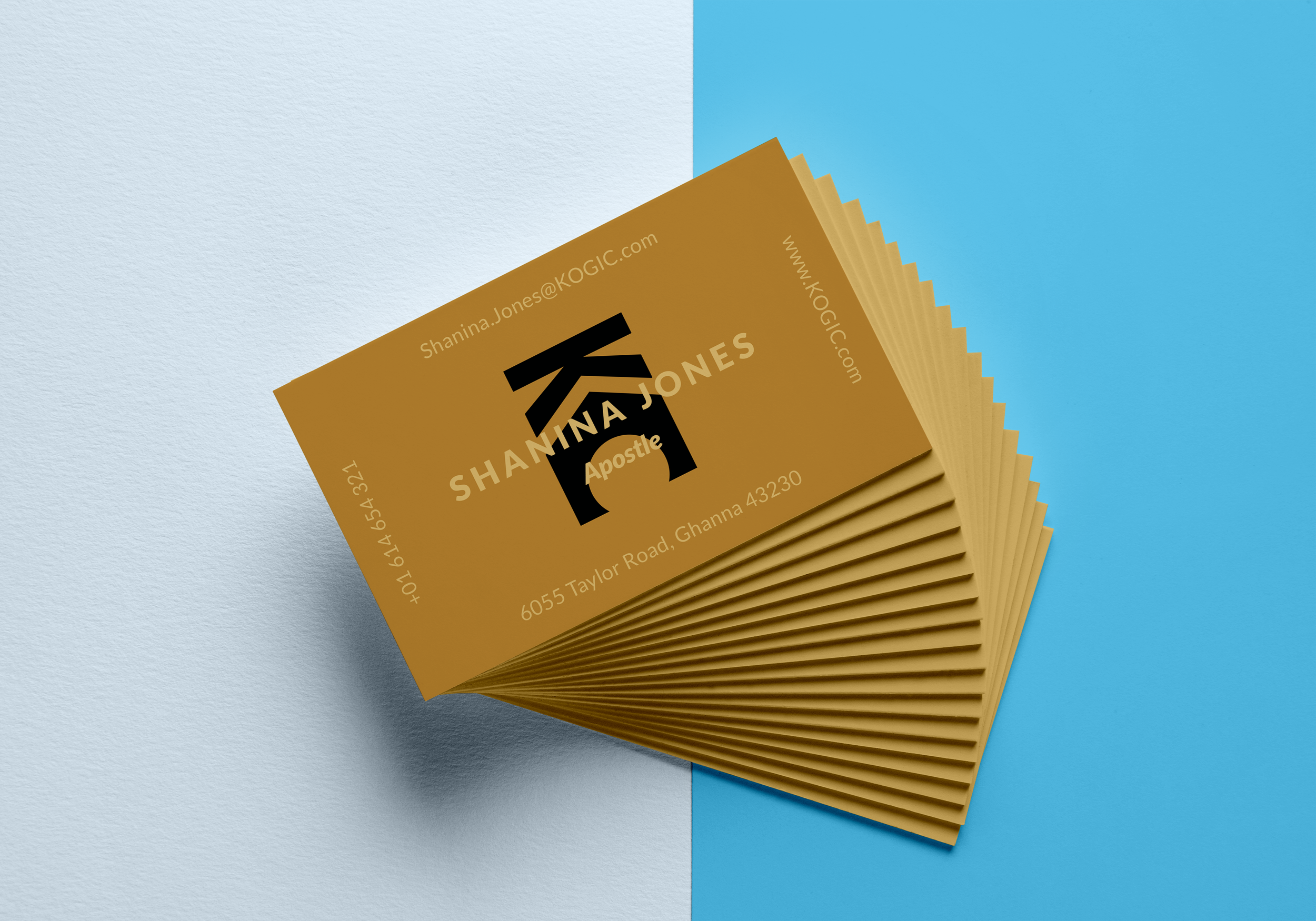
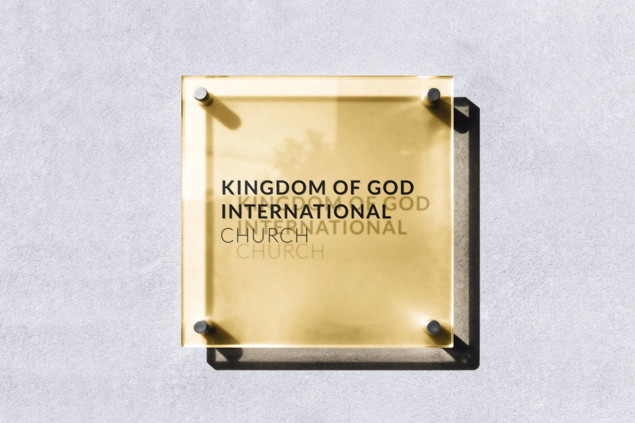
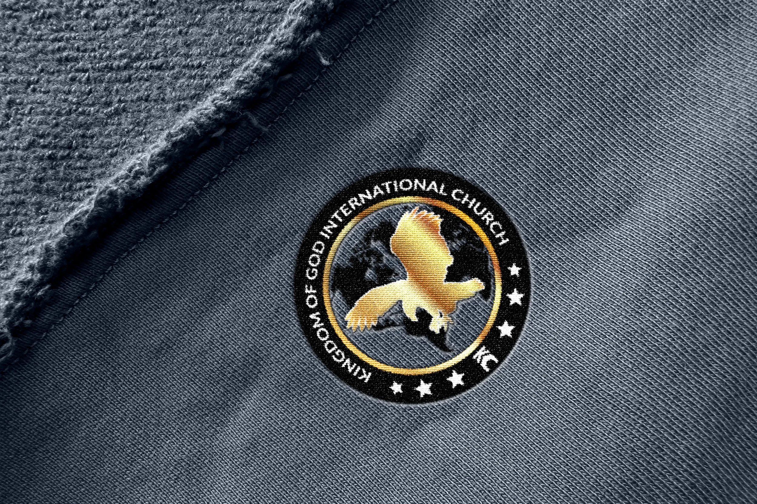
Kingdom Of God International Church
CASE STUDY 02
Religious Organization
Long term
discovery:
Purpose-Led Branding
client states “we just arent growing online no matter what we post”
Strategy:
The strategy focused on building a unified brand system from the ground up. Foundational elements including logo variations, color palette, typography, tone, and voice were developed and consolidated into clear brand guidelines to ensure consistency across platforms and ministries.
Using the BRANDO framework, the brand’s architecture and messaging were structured for clarity, authenticity, and audience connection. To support long-term adoption, the strategy extended beyond creation into education, with direct coaching for the media team to ensure the identity was understood, implemented correctly, and sustained across all departments.
Execution:
Execution focused on applying the strategy through a complete and scalable brand system. A full logo package was delivered with versions optimized for digital, print, and merchandise, ensuring consistency across all touchpoints. Branded materials, including notebooks and packaging, were introduced as functional extensions of the identity for members and visitors.
To support internal alignment, training materials and branding SOPs were developed to guide consistent use across departments. Ministries received clear direction on tone, visuals, and messaging, resulting in stronger cohesion and a unified presence across church communications and engagement.
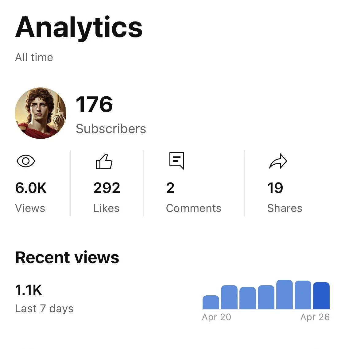
📞 +400% increase in calls made to the church
📍 +43% increase in direction requests through Google and social platforms
🌐 +10% growth in website visits
👀 +187% increase in profile views on digital platforms
📞 +400% increase in calls made to the church 📍 +43% increase in direction requests through Google and social platforms 🌐 +10% growth in website visits 👀 +187% increase in profile views on digital platforms
CASE STUDY 03
CASE STUDY 02
The Challenge:
The existing logo was not production-ready. Thin typography failed to reproduce cleanly in print, creating issues with legibility, consistency, and packaging quality. Without adjustment, the brand risked unpolished presentation across physical products and merchandise.
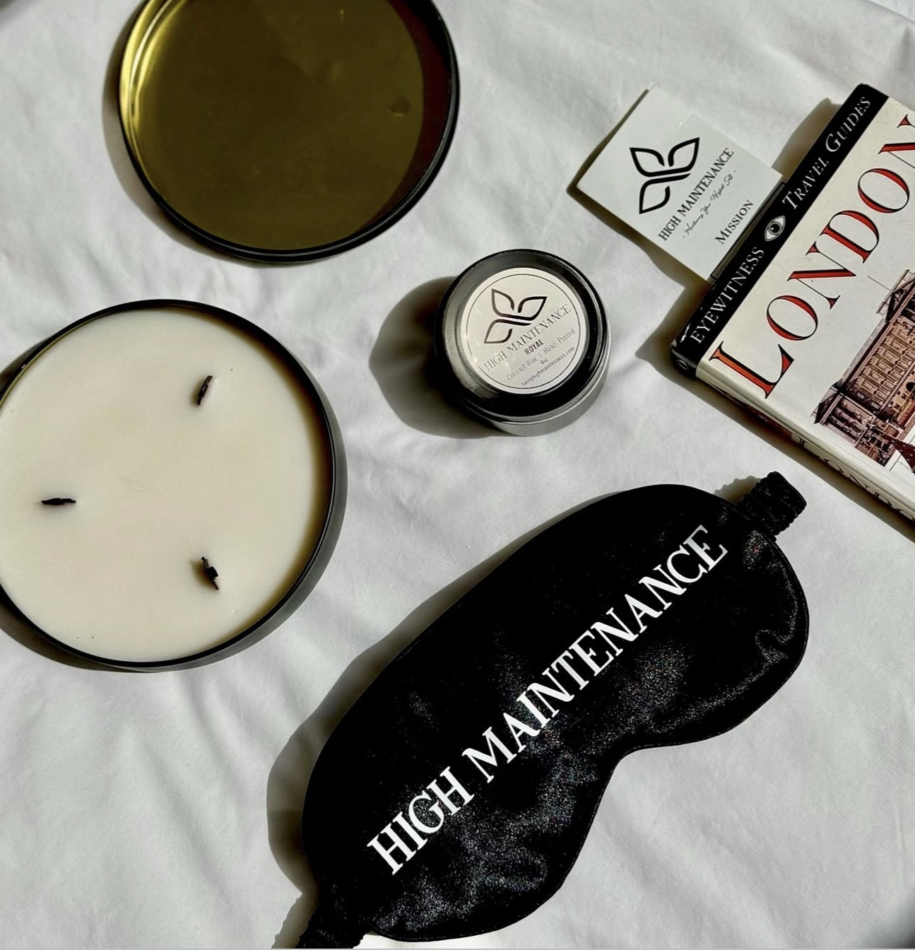
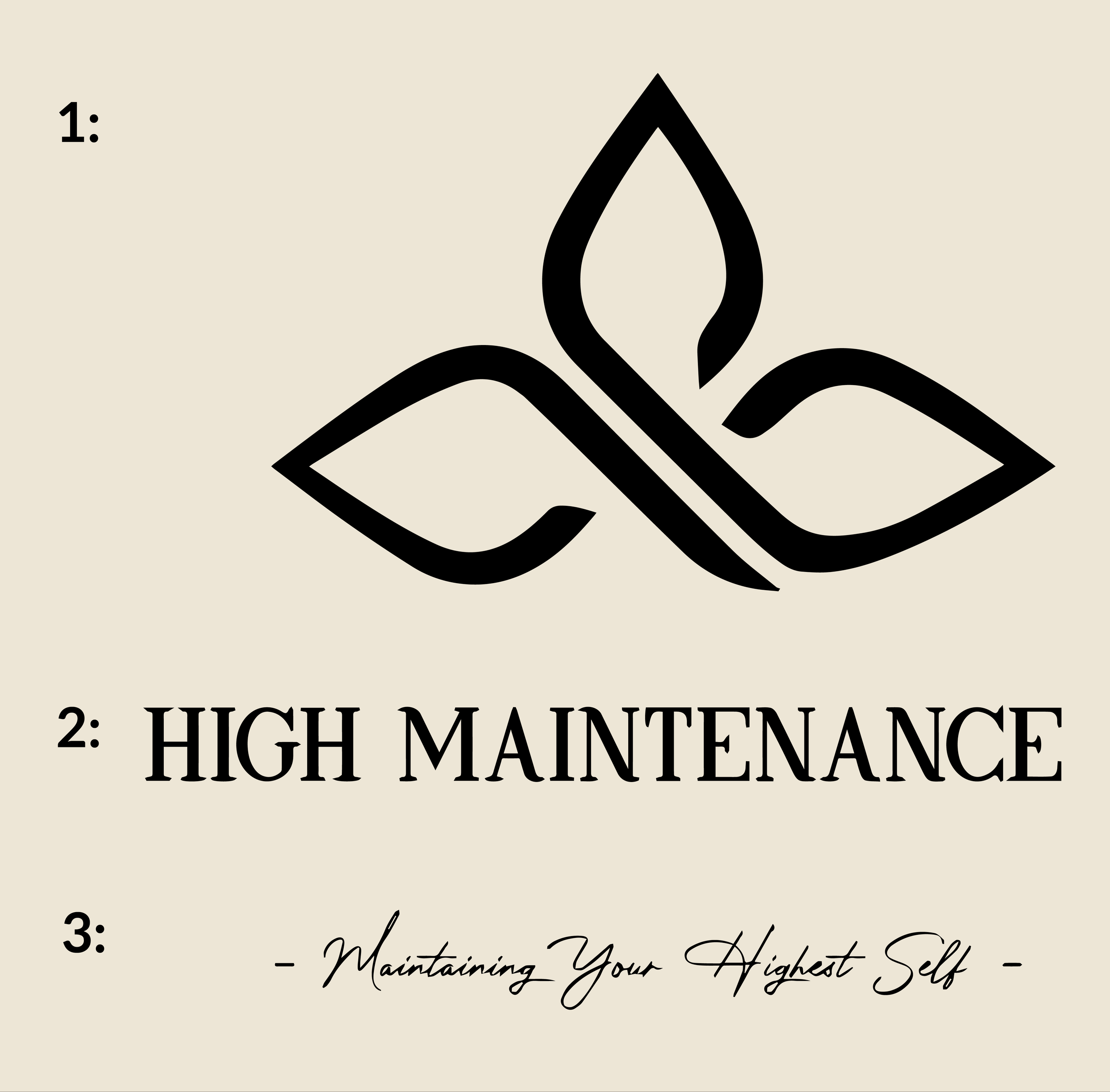
Living High Maintenance
CASE STUDY 03
Candle Company
Short term
discovery:
Production Constraints
client states “My machine does not work for my logo (cry face emoji)”
Strategy:
The strategy focused on auditing the client’s existing logo assets to identify technical weaknesses affecting print and production. By evaluating font weight, scalability, and reproduction integrity, we isolated the specific elements preventing clean application across packaging and merchandise. The goal was to correct production issues while preserving the brand’s visual character, ensuring the identity could function reliably across all physical and digital outputs.
Execution:
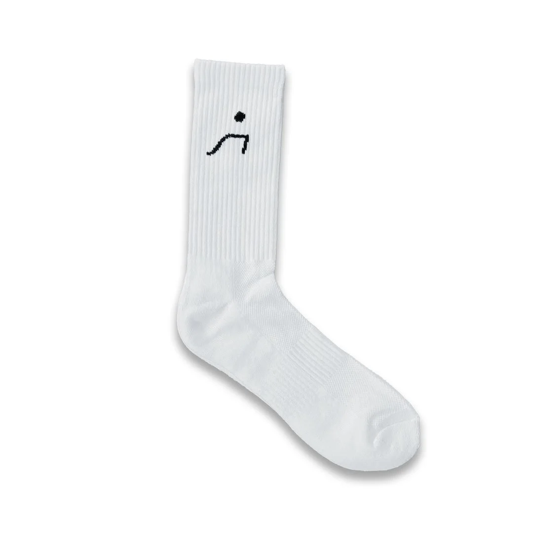
Execution focused on correcting production issues while maintaining brand integrity. The logo’s stroke weight was increased in Adobe Illustrator to ensure clean, consistent print reproduction. The identity was then separated into three distinct logo assets, each optimized for different use cases, allowing the client to apply the brand confidently across packaging, merchandise, and digital formats.
CASE STUDY 04
CASE STUDY 04
The Challenge:
The client needed to increase traffic and grow subscriber count on their YouTube channel. While content was being produced, there was no clear strategy guiding discovery, audience retention, or consistent growth.
Alexanderthegreat-356
Youtube Channel
Consulting
discovery:
Unfocused Content Strategy
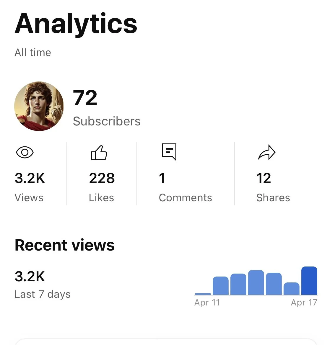
client states “My channel is not growing”
Strategy:
The strategy focused on increasing visibility through consistency and relevance. Posting frequency was standardized to one video per day or a minimum of four per week, timed around peak audience activity. Content was refocused to deliver information directly aligned with audience interests, creating a steady flow of traffic while improving discoverability and subscriber growth
Execution:
Execution focused on accelerating content production without sacrificing relevance. AI tools, including ChatGPT, were used to efficiently develop story concepts and structured narratives aligned to audience interests. Content was then produced and edited using YouTube’s native tools, incorporating video and music to maintain consistency and speed of publishing.
This approach reduced friction in the creation process, enabled higher output volume, and supported the cadence required to sustain channel growth


CASE STUDY 05
CASE STUDY 01
CASE STUDY 05
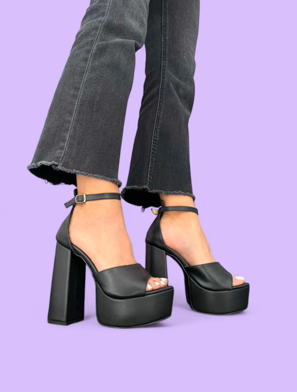
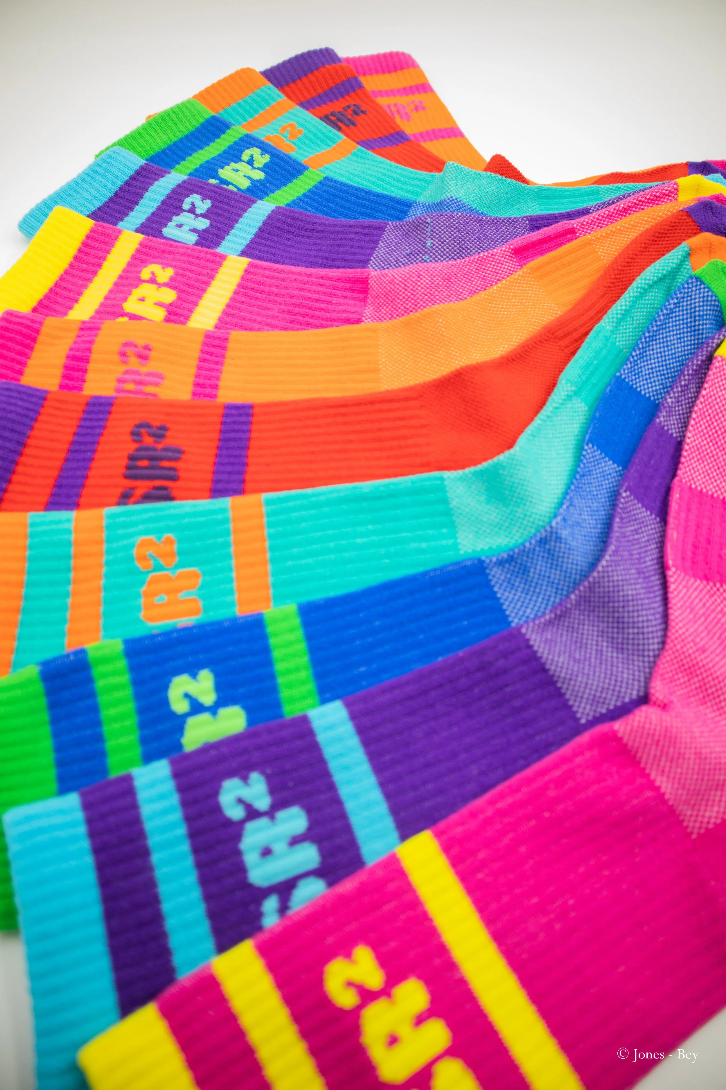
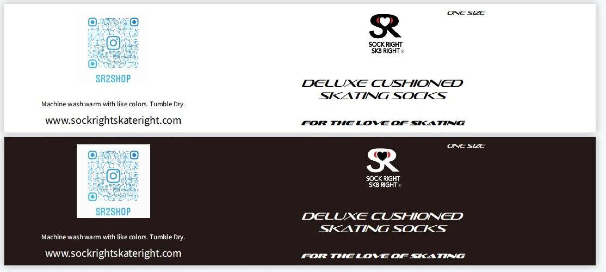
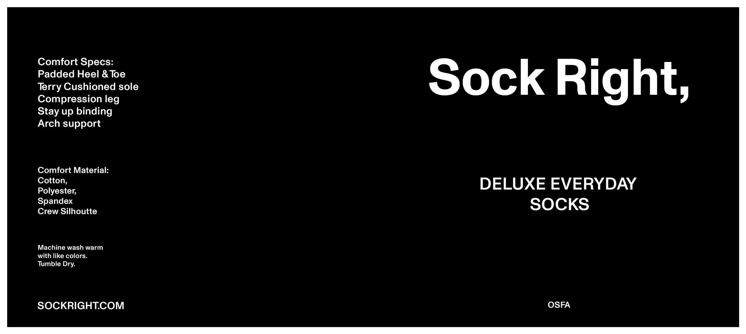
SockRight,
The Challenge:
SockRight had a high-quality product backed by research and development, but lacked clear positioning and a cohesive brand system to support growth. Underdeveloped visual assets, inconsistent messaging, and an unstructured sales funnel limited recognition, conversion, and scalability. The brand reached a growth choke point and needed a strategy to scale without losing authenticity or community trust.
Clothing industry
Long Term
discovery:
Niche limitation
client states “We feel our brand has reached a ceiling”
Strategy:
The strategy focused on repositioning SockRight for scale while preserving its core identity. Product direction, positioning, and messaging were refined to support everyday athletic use, reinforced through local vendors and community pop-ups. Seasonal color releases and inventory expansion created short-term momentum while maintaining long-term brand consistency.
Skaters remained a priority audience through a separate lane under Stride Nation Coalition, allowing SockRight to expand its market without diluting its roots. Naming became the anchor of the strategy, with the transition to SockRight and a disciplined wordmark system creating flexibility without overdesign. A structured sales funnel emphasized comfort, durability, and performance, while community and loyalty initiatives reinforced trust, purpose, and long-term brand relevance.
Execution:
Execution translated strategy into repeatable, scalable systems. Product development prioritized performance, comfort, and durability, supported by intentional packaging that reinforced simplicity and quality. The visual identity evolved through a disciplined wordmark system that scaled cleanly across products, partnerships, and platforms.
Strategic campaigns and community events were activated through aligned partnerships rather than one-off promotions. Repeatable sales funnels and internal processes were implemented to capture new customers, reinforce loyalty, and convert engagement into sustained revenue—reinforcing clarity, consistency, and long-term brand health.
CASE STUDY 06
CASE STUDY 01
CASE STUDY 06
The Challenge:
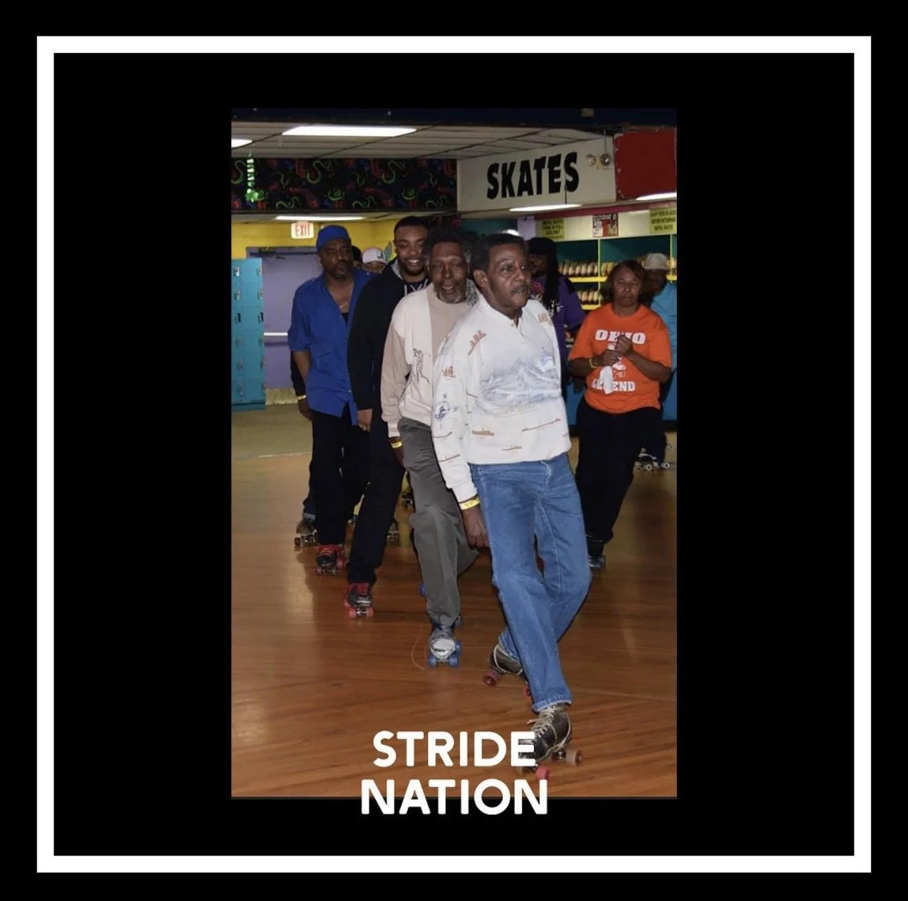
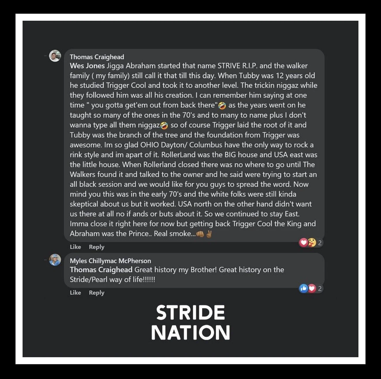
Columbus, Ohio had a deep and authentic roller skating culture, but no brand was actively capturing or protecting it. Post-COVID visibility brought outside commercial interest that risked reshaping the culture for capital gain rather than preservation. The challenge was to build a brand that could control the narrative, document the culture responsibly, and preserve its soul while remaining culturally rooted and enduring.
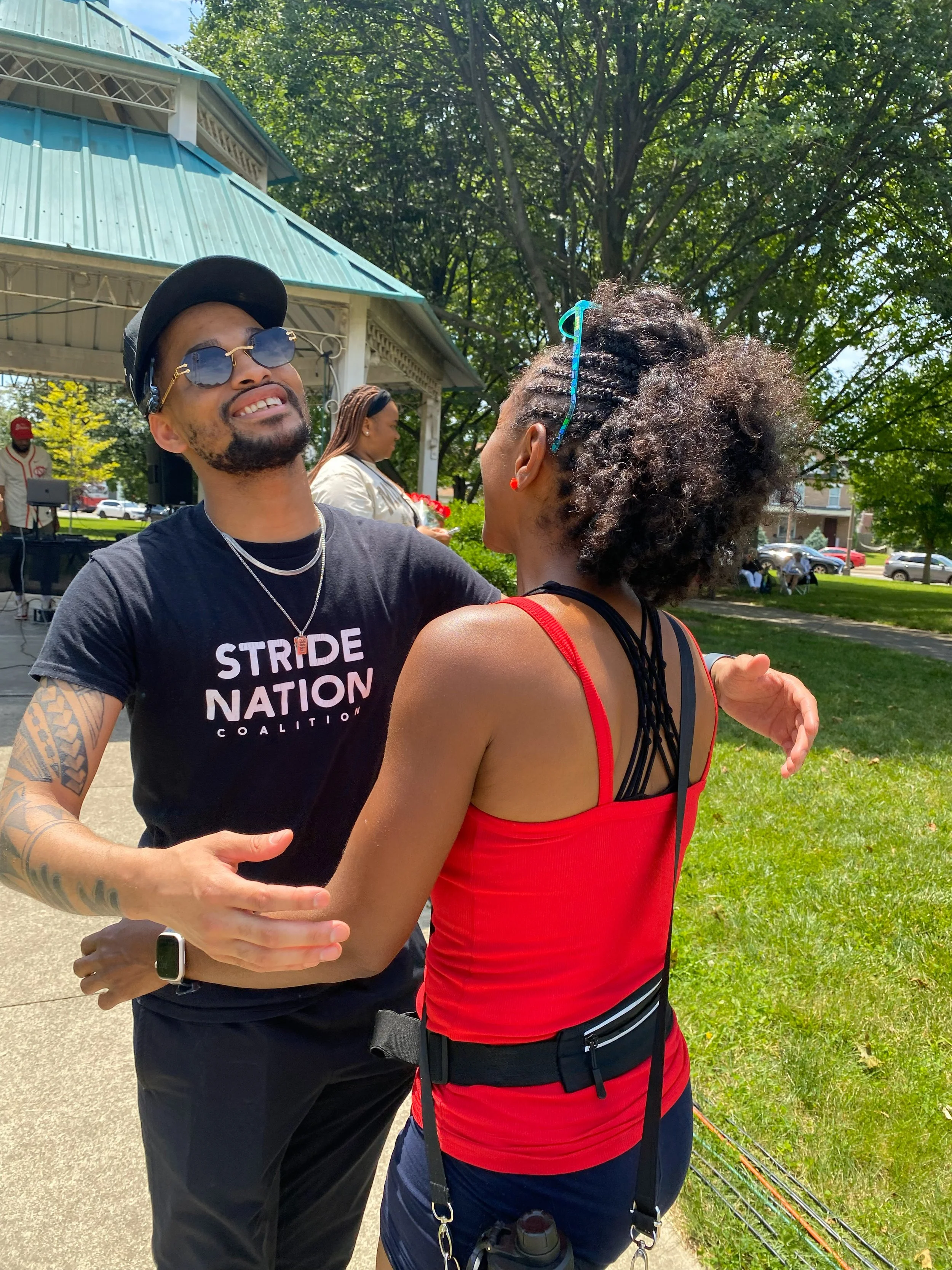
Stride Nation Coalition
Historic Achiever
Long Term
discovery:
Unclaimed Identity
client states “We need to capture us before somene else does”
Strategy:
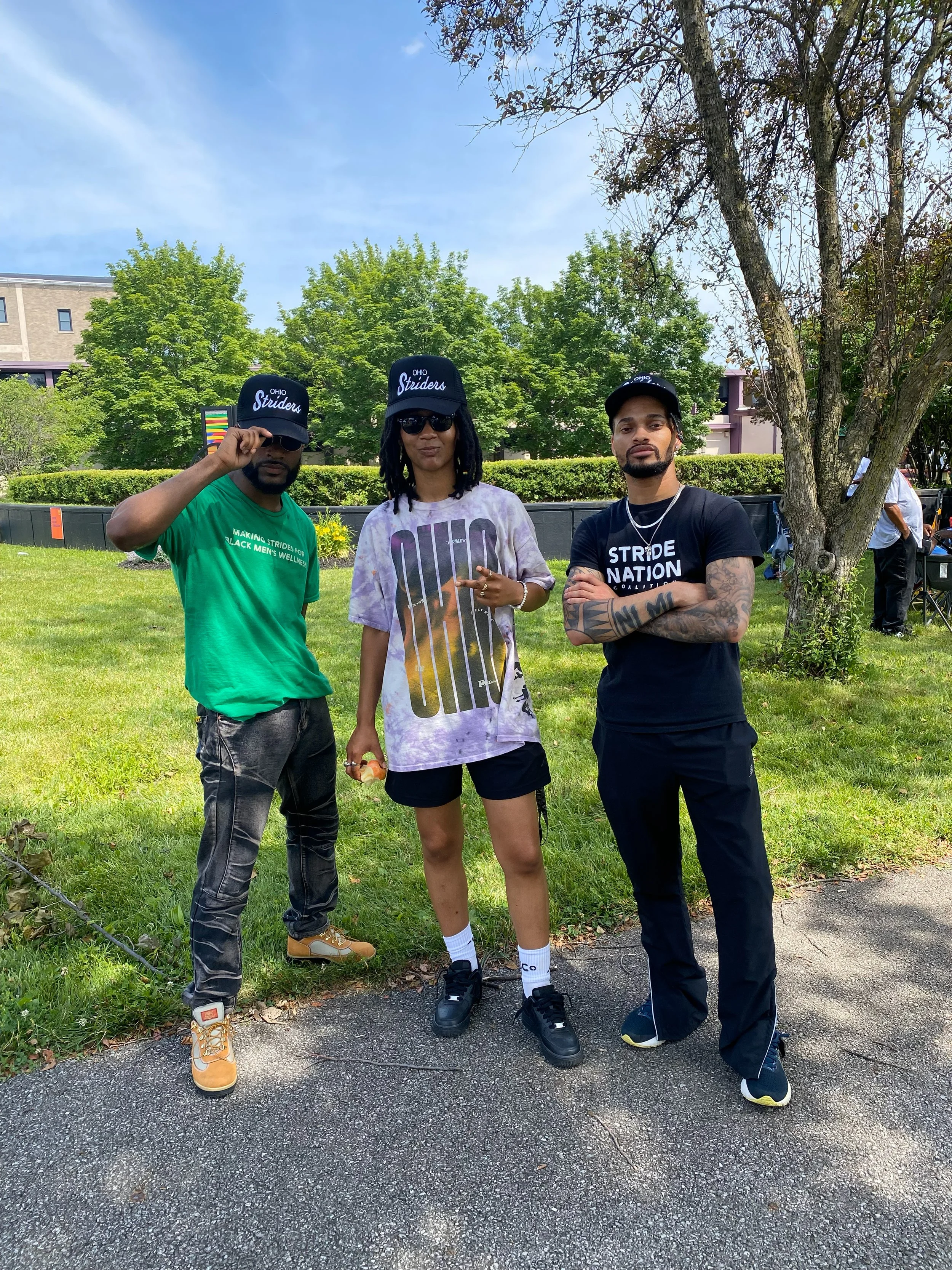
The strategy focused on community-led positioning rather than traditional skate marketing. Stride Nation Coalition was designed to introduce Columbus skate culture to new audiences while preserving cultural integrity and elevating the city’s unique style of pearling, or striding.
Product creation functioned as a cultural bridge, not a commercial driver. Limited releases and aligned partnerships leveraged post-COVID interest in skating, using intentional visibility and authentic moments on social media to expand reach responsibly without exploiting the culture.
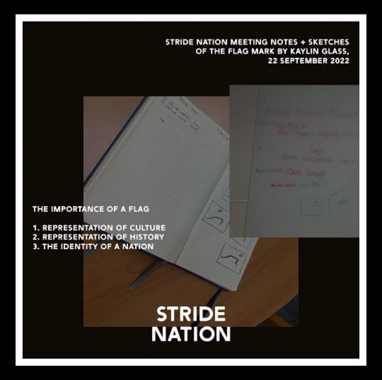
Execution:
Execution began with a complete brand build rooted in cultural symbolism. A flag was created to represent Columbus skate culture, using vibrant blue and orange to reference the iconic vintage orange rental wheel. Visual identity was treated as the most critical element of the brand, as capturing the audience required an immediate emotional and cultural connection through look, feel, and tone.
Partnerships were formed with intention rather than scale. While the audience spanned multiple generations of skaters, collaborators were selected based on shared values, cultural respect, and commitment to preservation rather than reach alone. Marketing campaigns were designed to support product launches and cultural storytelling, anchored by the creation of a dedicated social media presence that documented, highlighted, and elevated Columbus skate culture in real time.